Wasted Growth: A Bold Display Font for Digital Brand Impact
As a web designer who ships landing pages, SaaS dashboards, and conversion-optimized e-commerce experiences, I treat typography like infrastructure—not decoration. When I need a display font that commands attention without sacrificing clarity or brand coherence, Wasted Growth has become my go-to for high-intent visual moments.
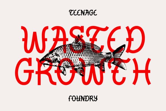
Wasted Growth is a tightly crafted display font with sharp angles, deliberate irregularity, and a grounded yet expressive rhythm. It’s not chaotic—it’s intentionally weighted, with strong vertical stress and confident spacing that holds up even at smaller sizes on modern screens. Unlike many decorative fonts that collapse in responsive layouts, Wasted Growth maintains its character from desktop hero sections down to mobile app banners—provided it’s used intentionally.
Where Wasted Growth Earns Its Place Online
This isn’t a body text font—and it shouldn’t be. Wasted Growth shines where hierarchy needs reinforcement: hero headlines, section dividers, CTA buttons, course title cards, and branded social banners. On a coaching website, pairing Wasted Growth with a neutral sans serif like Inter or Manrope creates immediate contrast: the display font delivers tone (“bold, human, no-nonsense”), while the supporting type ensures scannability and trust.
I’ve used it successfully in:
- Landing page headers—especially for creative tools or indie products where personality matters more than polish;
- Online store banners—overlaid on lifestyle imagery with subtle text shadows or light/dark mode-aware contrast;
- Course sales pages—as module titles or benefit-driven subheads (“Build Faster,” “Ship With Confidence”);
- Portfolio site navigation accents—not for full menus, but for hover states or category labels that anchor visual flow;
- Branded digital assets—like email header graphics, Notion templates, or Figma UI kits where consistent voice across touchpoints builds recognition.
Readability & Responsiveness: Practical Guardrails
Wasted Growth works best at 18px and above on desktop, and 20px+ on mobile—especially over image backgrounds. Its letterforms have enough internal whitespace to avoid crowding, but tight tracking can reduce legibility in long phrases. For that reason, I limit usage to short, high-impact text: under six words per line in most cases.
On dark mode interfaces, I apply a subtle white stroke (1px) or soft outer glow to ensure contrast meets WCAG AA standards. Over light backgrounds, I use a 2–3% opacity black drop shadow for depth—never heavy enough to distract, just enough to lift the type off the surface. And yes—I always test on real devices: iOS Safari, Chrome Android, and macOS Safari all render its OpenType features cleanly.
Pairing With Purpose: What Works (and What Doesn’t)
Wasted Growth pairs exceptionally well with clean, low-contrast sans serifs—think Inter, Poppins, or IBM Plex Sans. Their neutrality lets Wasted Growth’s attitude breathe without competing. For editorial or premium brand sites, I’ve paired it with a restrained serif like IBM Plex Serif or Charter—but only for large headings over rich visuals, never for paragraph text.
Avoid pairing it with other display fonts, script fonts, or anything with competing texture. It’s not a team player in that sense—it’s a soloist. Also skip using it for logos unless your brand thrives on raw, unfiltered energy; it lacks the versatility of a custom logotype but excels as a headline amplifier.
Bonus Illustrations: More Than Just Decoration
The included 9 bonus illustrations aren’t filler—they’re intentional design accelerators. I’ve dropped them directly into Figma as layered vector assets to align with Wasted Growth’s proportions: icon-style glyphs that echo its angular confidence, scalable without loss, and ready for SVG export. They work especially well as section anchors beside H2s or as animated hover elements in Next.js or Astro projects.
Licensing & Real-World Deployment
Wasted Growth is a commercial font, and its license covers web use—including self-hosted @font-face embedding, client projects, online stores, SaaS platforms, and digital templates sold on marketplaces. No monthly subscription, no domain limits, no hidden restrictions. That means you can embed it in your Shopify theme, your Webflow site, or your React-based dashboard without renegotiating terms each time.
It ships in WOFF2 (primary), WOFF, and OTF formats—with full OpenType support for ligatures and stylistic alternates. While it doesn’t include extended Latin or Cyrillic coverage out of the box, the core character set handles English, Spanish, French, German, and Dutch seamlessly—more than enough for most digital product launches and regional campaigns.
When to Reach for Wasted Growth—And When to Step Back
Use Wasted Growth when your goal is to signal authenticity, momentum, or creative authority—not perfection. It fits brands that say “we build, we ship, we iterate” rather than “we’re flawless.” It’s ideal for indie makers, dev tooling, creative agencies, podcast networks, and education platforms targeting builders—not boardrooms.
Don’t reach for it when you need universal readability at small sizes, multilingual support beyond Western Europe, or delicate elegance. It won’t soften your tone—it’ll sharpen it. And that’s exactly why it works.
In a landscape saturated with safe, algorithm-friendly fonts, Wasted Growth is a reminder that digital typography still has room for conviction—when applied with intention, restraint, and respect for how people actually read on screens.