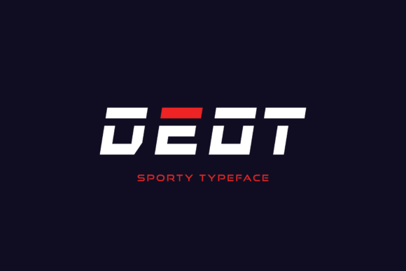
Deot: A Bold Display Font for Digital Impact
As a UI designer who ships landing pages, SaaS dashboards, and conversion-optimized e-commerce sites, I treat typography like interface logic—not decoration. Every font choice affects how fast users scan, where their eyes land, and whether they trust the brand behind the screen. That’s why Deot stands out in my toolkit: it’s not just another bold font—it’s a tightly crafted display typeface built for digital clarity, visual authority, and intentional hierarchy.
Deot features strong, blocky glyphs with clean geometric proportions and subtle futuristic tension—think sharp corners balanced by consistent stroke weight and generous x-height. It’s unapologetically bold, yet never visually noisy. Unlike many high-contrast or overly stylized display fonts, Deot maintains legibility even at smaller sizes on high-DPI screens, especially when used for short, high-impact text. Its personality is sporty, confident, and modern—ideal for brands that want to signal energy without sacrificing professionalism.
Where Deot Earns Its Place in Web Layouts
In real-world web projects, Deot shines where attention must be directed—not diluted. I use it most often for hero section headlines, primary CTA buttons, product name tags, and section headers that anchor content rhythm. On a fitness app’s landing page, pairing Deot with a neutral sans serif body font creates immediate contrast between motivational messaging (“Train Smarter”) and functional copy (“Start your 7-day free trial”). The same works for boutique online stores: Deot on a banner like “Limited Drop Live Now” stops scrolling without needing animation or color tricks.
It’s less effective—and I avoid it—for long-form body copy, navigation menus, or form labels. Deot is a display font, not a workhorse text face. Its strength lies in brevity: one line, two words, three syllables max. That constraint actually makes it more powerful. When used for logo text (especially in SVG or inline font embedding), Deot holds up across favicon, mobile app icon, and dark-mode headers—no distortion, no aliasing, no compromise.
Readability & Responsiveness: Practical Notes
On mobile, I size Deot headlines between 28px–42px depending on viewport width, always testing on iOS Safari and Chrome Android. Its generous counters and open apertures prevent crowding at smaller sizes—unlike many condensed display fonts that blur into illegibility below 32px. For dark backgrounds, I keep letter-spacing tight (0.5px–1px) and avoid full black (#000); instead, I use #111 or #222 to reduce glare and improve contrast ratios against deep grays.
When overlaying Deot on imagery—say, a lifestyle photo banner—I add a subtle semi-transparent background bar or apply a light text shadow (1px 1px 2px rgba(0,0,0,0.2)) to ensure readability across variable lighting conditions. No need for heavy outlines or fills: Deot’s inherent weight carries through cleanly.
Smart Pairings for Balanced Digital Typography
Deot thrives in contrast. I pair it almost exclusively with highly legible, low-personality sans serifs—like Inter, Manrope, or IBM Plex Sans—for body copy, captions, and interface labels. This combo delivers clear visual hierarchy: Deot sets tone and intent; the sans serif handles function and flow. For editorial or premium brand sites—think coaching platforms or creative course marketplaces—I’ll occasionally pair Deot with a restrained serif like Cormorant Garamond (for headings only) to add quiet sophistication while keeping Deot as the sole display voice.
Avoid pairing Deot with other decorative, script, or handwritten fonts. Its blocky confidence clashes with organic flow. Likewise, steer clear of ultra-thin or ultra-light companions—they undermine Deot’s presence rather than support it.
Licensing, Formats, and Real-World Deployment
Before integrating Deot into any client site, SaaS dashboard, or Shopify theme, I verify its commercial license covers webfont usage—including self-hosted @font-face, CDN delivery, and template redistribution. Most reputable vendors include WOFF2 files (for compression), CSS variable support (if available), and fallback options for older browsers. I also check whether multilingual characters—like accented Latin, Cyrillic, or basic Greek—are included, especially for global-facing products or EU-based clients.
If the Deot package includes stylistic alternates (e.g., rounded corners or tighter tracking variants), I reserve those for micro-interactions—hover states on CTAs, animated headline reveals, or branded loading indicators—not static layouts. Consistency matters more than novelty in production interfaces.
Use Cases That Prove Its Value
- Creative portfolios: Deot for project titles over full-bleed visuals—clean, memorable, instantly scannable.
- Online course sales pages: Hero headline + subhead combo (“Master UI Motion — Deot + Inter”) builds credibility before the first scroll.
- Product landing pages: Feature headers like “Built for Speed” or “Zero Setup” gain weight and urgency without extra UI elements.
- Blog headers & social graphics: Used consistently across Twitter banners, LinkedIn cover images, and newsletter headers, Deot reinforces brand recognition faster than logos alone.
- Digital brand kits: As the sole display font in a kit, Deot simplifies asset creation—no guesswork about when to use “bold,” “extra-bold,” or “black.” One weight, one purpose.
Deot isn’t about trend-chasing. It’s about solving real layout problems: cutting through visual noise, reinforcing brand voice in under two seconds, and guiding users toward action—without relying on color, motion, or layout tricks. In a world of shrinking attention spans and rising ad fatigue, that kind of typographic intentionality isn’t optional. It’s foundational.