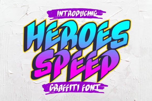
Heroes Speed: A Bold Display Font for Digital Impact
As a UI designer who ships landing pages, SaaS dashboards, and conversion-optimized online stores, I treat typography like interface logic — every font choice affects scanning speed, emotional resonance, and perceived credibility. Heroes Speed stands out not just for its visual punch, but for how precisely it serves high-intent digital moments: hero sections that stop scrolls, CTAs that demand attention, and brand headers that signal creative authority without sacrificing clarity.
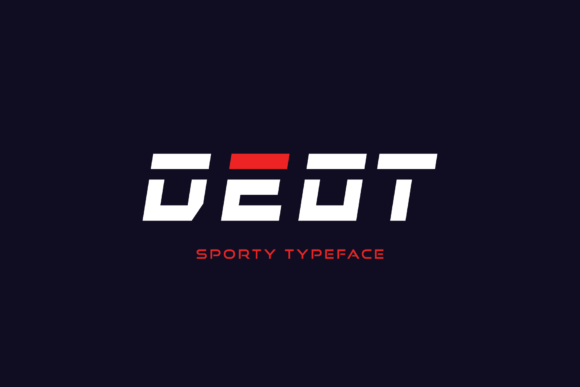
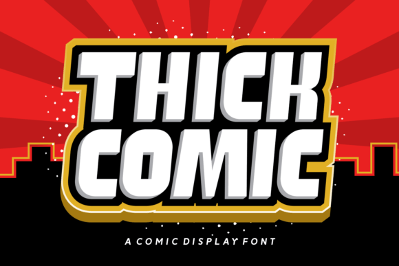
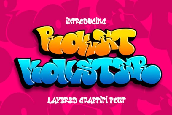
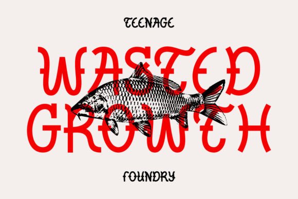
This is a display font — not meant for paragraphs or navigation menus, but engineered for impact at scale. Its graffiti-inspired structure is bold, confident, and deliberately “fatty”: thick strokes, sharp angles, and kinetic energy built into the letterforms. Unlike over-rendered script fonts or chaotic handwritten styles, Heroes Speed maintains strong character recognition even at smaller sizes — crucial when used on mobile hero banners or app splash screens where users glance for under two seconds.
In practice, I reach for Heroes Speed when the goal is immediate tonal alignment. A boutique fitness coaching site uses it for its headline “Move Faster. Think Clearer.” — the font’s urgency mirrors the brand’s energetic promise. A digital art course platform applies it to section headers like “Week 3: Break the Grid”, reinforcing creative rebellion while keeping hierarchy intact. Even on dark-mode interfaces, Heroes Speed holds up: its contrast-rich outlines retain legibility against deep navy or charcoal backgrounds, especially when paired with subtle text shadows or light overlays.
Readability isn’t compromised — it’s redirected. You wouldn’t use Heroes Speed for body copy, and that’s intentional. Its strength lies in guiding the eye *to* what matters: a product name above a CTA button, a limited-time offer banner, or a logo lockup on a portfolio homepage. On responsive layouts, I size it generously on desktop (64–96px), then scale thoughtfully for tablet (48px) and mobile (36–40px), always testing line height and letter spacing to preserve rhythm. Tight tracking works well for short phrases (“GO LIVE”), while slightly increased spacing improves scanability for multi-word headlines.
Font pairing is where Heroes Speed truly shines in web design. I consistently pair it with a neutral, highly legible sans serif — think Inter, Manrope, or even system fonts like -apple-system — for all supporting text. This creates a clean, professional contrast: expressive headline + trustworthy body = balanced digital identity. For editorial or luxury-leaning brands, a restrained serif like Cormorant Garamond (light weight) adds sophistication without competing. The key is contrast in function, not just style: Heroes Speed declares; the secondary font explains.
It performs exceptionally well across digital touchpoints. In online stores, it transforms category banners — “Summer Drops” gains instant energy without needing animation. On blog headers or social media graphics exported from Figma, its distinct shape ensures recognizability at thumbnail size. For SaaS onboarding flows, I’ve used it sparingly on step titles (“Connect Your Tools”) to add personality while maintaining scannability. And yes — it works in SVG-based logos and branded loading states, as long as the vector output preserves its crisp edges.
Licensing is straightforward but essential to clarify: Heroes Speed is a commercial font. That means it’s fully licensed for use on live websites, client landing pages, e-commerce product displays, digital ad creatives, and downloadable brand kits — no hidden restrictions for webfont embedding via @font-face or modern font hosting services. Always verify the license includes WOFF2 support (it does), which ensures fast load times and broad browser compatibility. It includes standard Latin characters and common punctuation — sufficient for English-language digital products, though multilingual expansion may require supplemental typefaces.
What sets Heroes Speed apart from other decorative display fonts is its intentional restraint. It doesn’t sacrifice structure for flair. Letters maintain consistent x-heights and baseline alignment, making it stable in grid-based layouts. Its alternates — if included — are subtle (slightly modified terminals or joins), not distracting flourishes. That stability matters when building reusable Figma components or CSS utility classes: you can trust spacing behavior across variations.
I’ve seen teams overuse expressive fonts and dilute their brand voice. With Heroes Speed, the rule is simple: deploy it where attention must land, not where information must be absorbed. Use it for your primary headline, your featured course title, your app’s launch tagline — then step back and let your content do the rest. That discipline is what makes it feel premium, not playful; distinctive, not distracting.
For digital creators building portfolios, launching products, or refining a brand’s online presence, Heroes Speed isn’t just another display font. It’s a deliberate tool for shaping first impressions, reinforcing tone, and elevating visual hierarchy — all while staying rooted in web usability. When your headline needs to say “this matters”, Heroes Speed says it with confidence, clarity, and controlled energy.
- Best for: Hero section headers, CTA buttons (short labels only), shop banners, course/module titles, portfolio project names
- Avoid for: Body text, navigation labels, form inputs, small mobile buttons (<24px)
- Pair with: Neutral sans serifs (Inter, Manrope) or refined serifs (Cormorant Garamond) for balance
- Test on: Mobile viewports, dark backgrounds, image overlays, and low-bandwidth simulators
- Verify: WOFF2 support, commercial license scope, and character set coverage before deployment